Treat Your Shelf
Web design & Branding
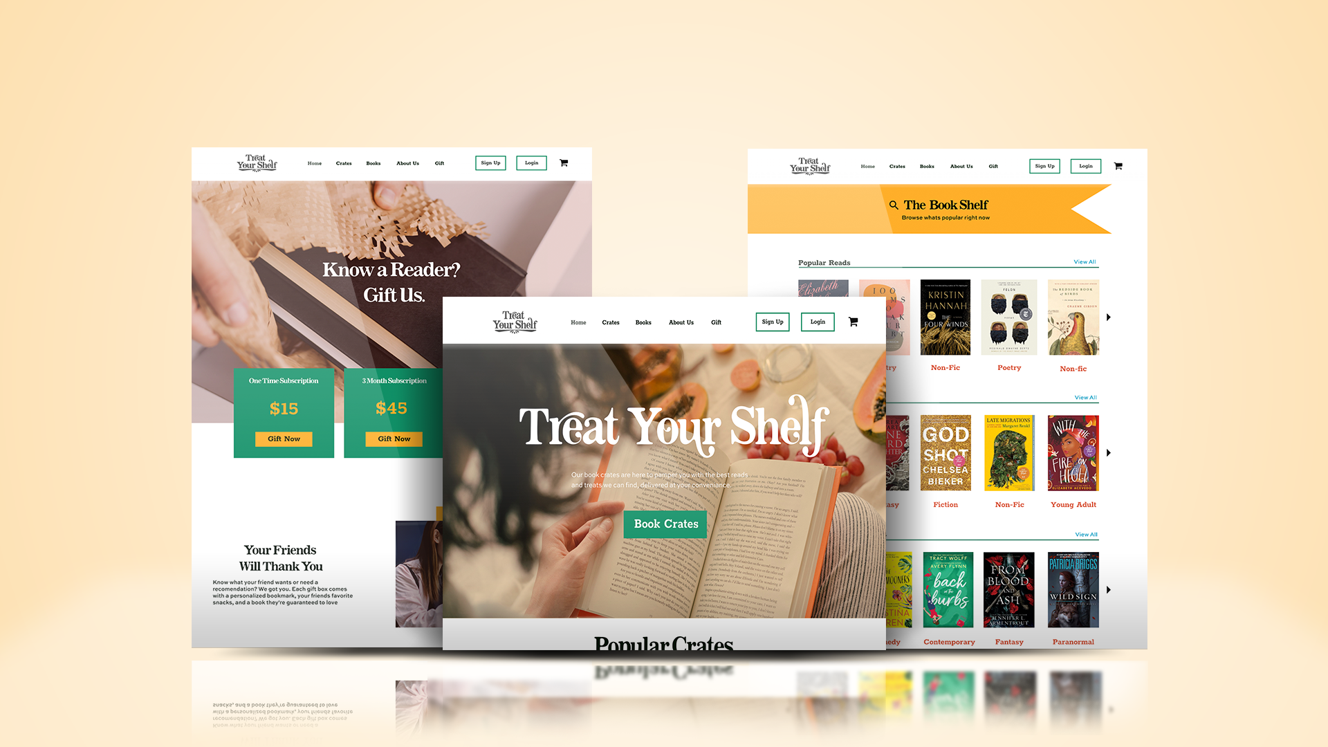
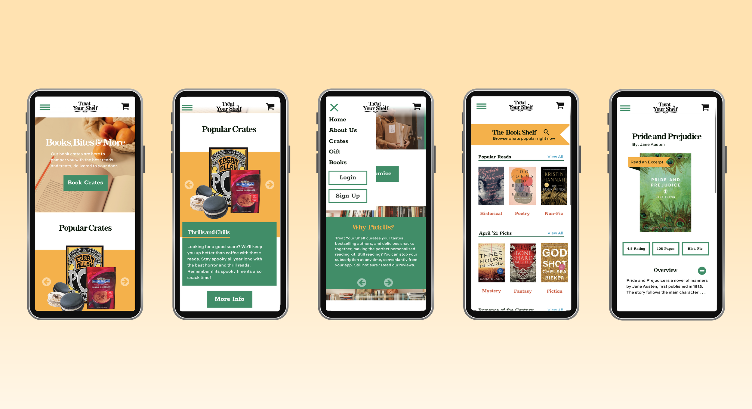
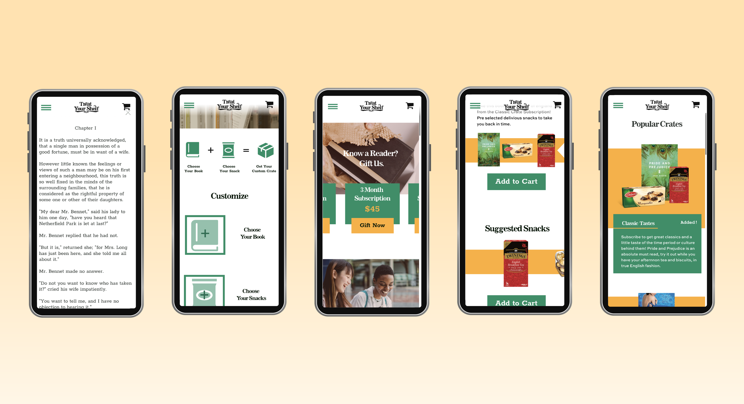
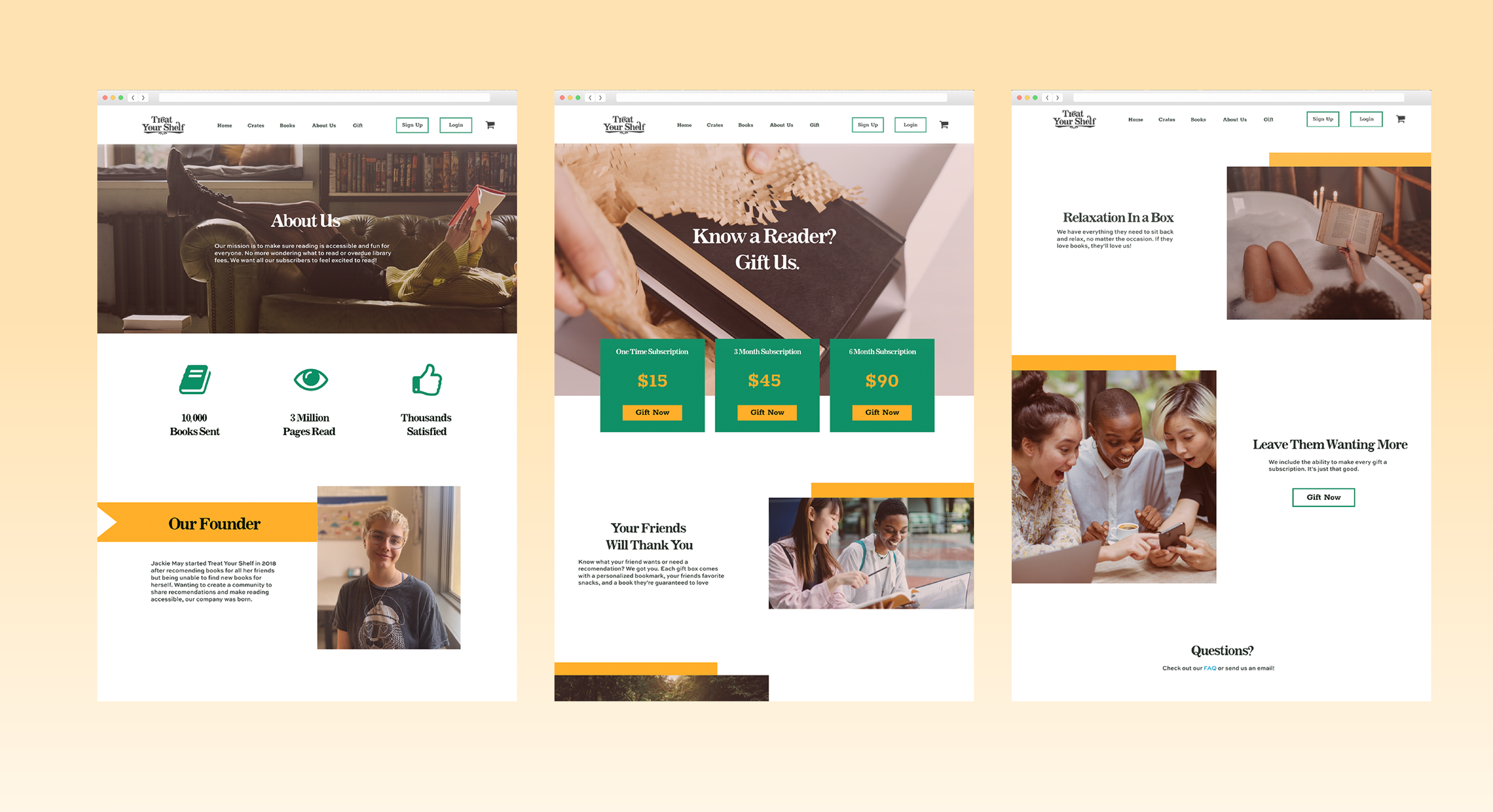
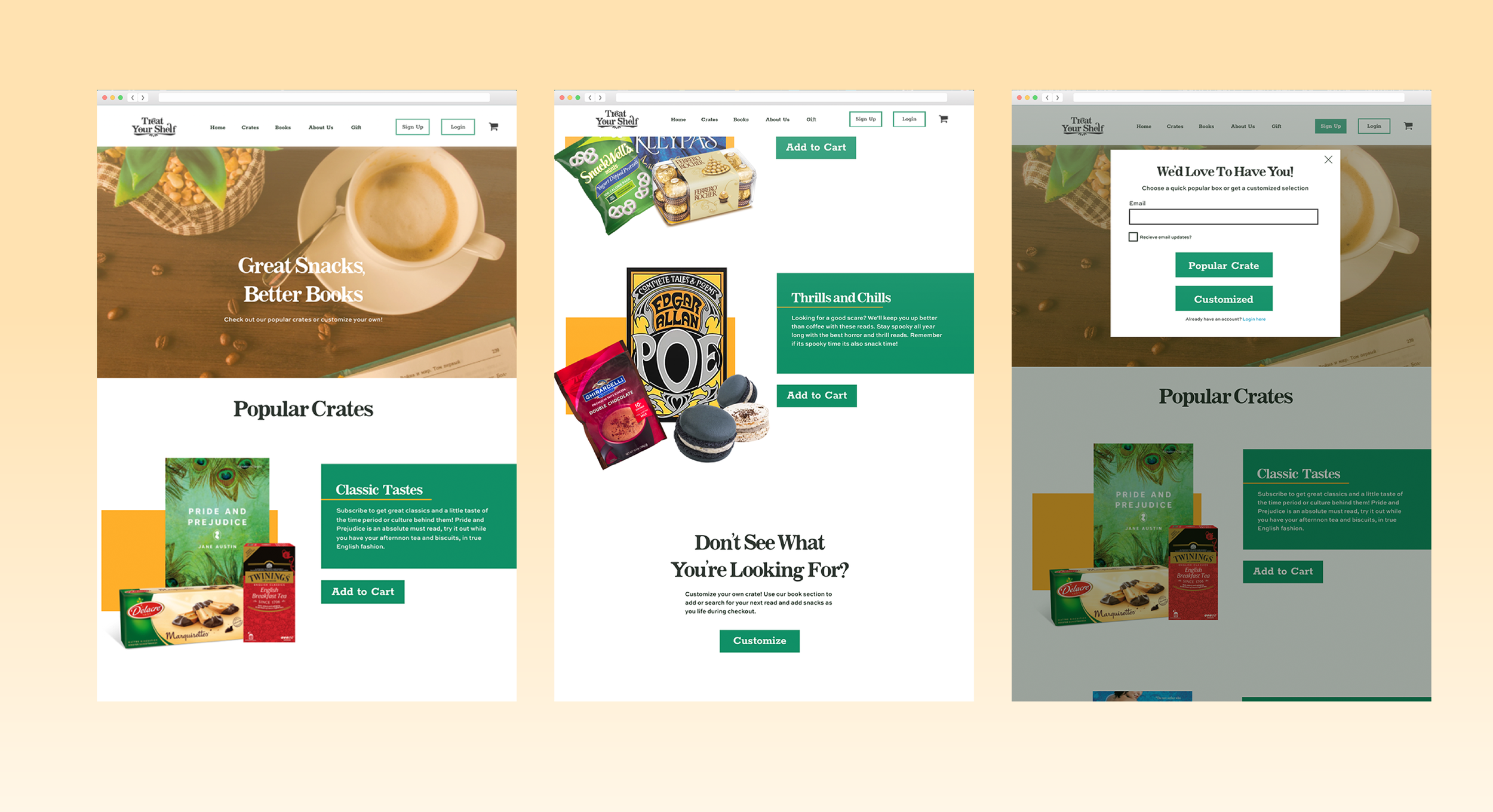
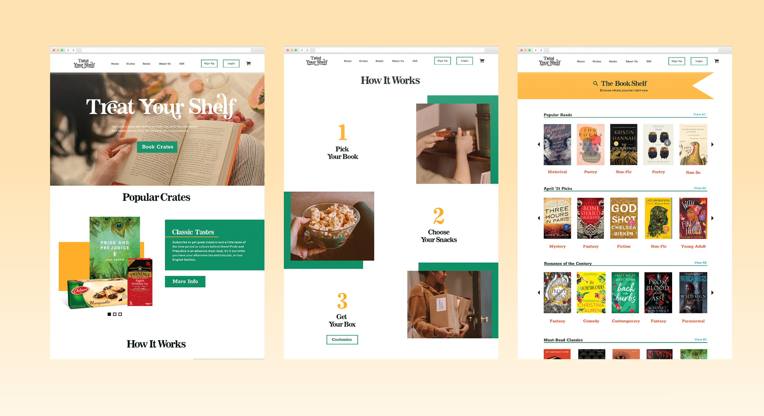
Treat Your Shelf is a branding project for a hypothetical book and snack subscription service. Treat your shelf seeks to take the stress out of finding a new book by providing curated choices as well as customizable options. Our book crates come with associated snacks and drinks to each novel. We aim to make reading easier and more self indulgent for everyone!
Prototypes
Goals
Ease of use/ clarity of material and navigation
Emphasize relaxing look and feel
Personalization/ customization options
Friendly/approachable/reliable/modern brand look
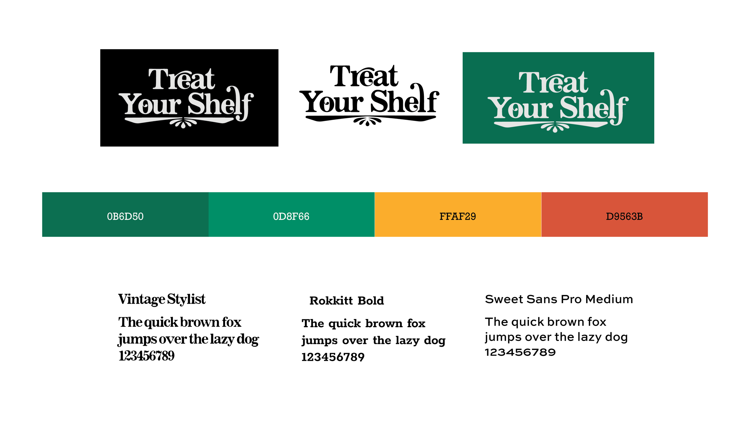
Behind the Brand
The logo imitates a book shelf with the type mark positioned on the horizontal shelf element below. The flower like teardrop shapes below the ‘shelf’ mimic the pages of an open book while also playing on the rounded end shapes of the type mark flourishes.
I chose Vintage Stylist as the logotype because I needed to have a distinct unique typeface that could translate well digitally. I wanted it to retain the classical book feel, with the serifs typically used in classic books but with a modern more rounded and relaxed end points. What really drew me in was the ligature system in addition to the regular characters that I used to make the type more interesting and dynamic.
Rokkit is structured, modern, and very legible in digital spaces so I chose this to balance the display type and keep it feeling new and fresh and not stuck in the past. Sweet sans was created with legibility and paired well without taking away from anything or being too distracting,
Web Style System
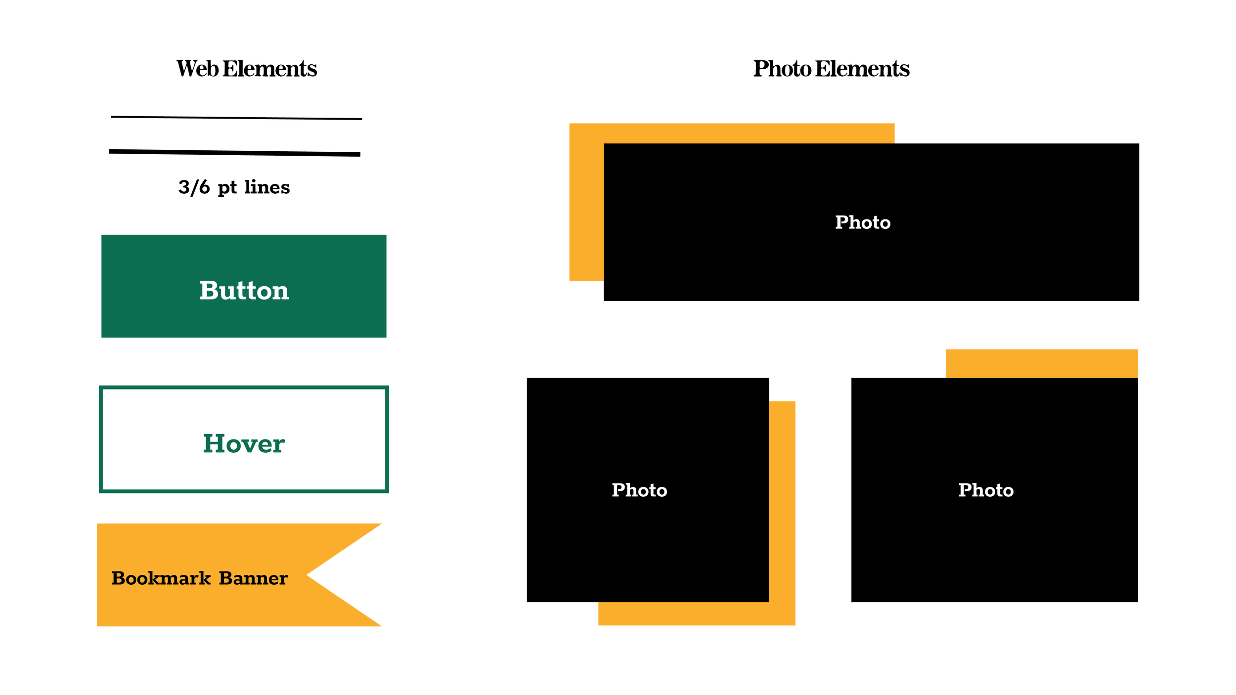
I kept my elements geometric and line focused using the layered effects on photos to still create a geometric rectangle or square. This system is versatile across multiple sizes and orientations making it useful on web while also bringing a pop of color and attention to help distinguish the hierarchal elements.
The bookmark banner maintains the geometric look while still adding some visual interest pertaining to the overall theme of books. Most of the elements were rather chunky or even weight throughout, imitating Rockitt in a modern clean and simple look.